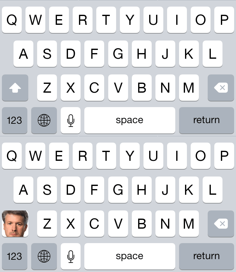
In iOS 7.1, Apple changed the design of the shift key. This was the worst thing to happen in the history of software.

When the shift key is on, it blends in with the letter keys. When it’s off, it blends in with the function keys. Neither state sticks out enough to read as active, especially in a split second.
This would only be moderately annoying, except that iOS suddenly engages the shift key in certain circumstances. It’s usually convenient, but if you need to type apike is my username, I am from B.C. and live in Vancouver it’s crazy-making and requires good feedback about what’s happening.
Since 7.1, this confusing shift key has been the subject of instructional articles, mockery, and even an entire web site: IsMyShiftKeyOnOrNot.com. A whole OS release later, many of us boneheads still find ourselves wrestling an inscrutable toggle, trying to somehow, somehow type a lower-case letter.
Still, I kept my mouth shut since it was clear they would fix such an obvious issue in iOS 8. Which they sort of did, if you count the ability to install custom keyboards. Indeed, all of the iOS 8 custom keyboards I’ve tried, even the dumb ones, have much clearer shift keys than Apple’s.
Unfortunately, none of the keyboards I’ve tried so far work quite as well as the default one. Even if I did like one of the custom ones, the system still kicks you to the default keyboard in a situation where shift key state is fairly crucial: entering a masked password.
Tell me something, anything
There have been some proposals on how to fix this. For example, the proposal from Geoff Teehan to adopt Android’s approach of changing the keyboard’s keys to lowercase when shift is off. While it would work, the result is jarring and is outside the bounds of Apple’s design aesthetic.


There is a simpler solution to the problem, which is what they did for iOS’ dark style keyboard: make the shift key’s active state different than any other key on the keyboard. It doesn’t matter how it’s different - as long as the active state is unique, it will be readable.
Now, I’m not naïve - this has surely been proposed and dismissed inside Apple. Given how much backlash there was about this issue, there were surely internal advocates of a more clear shift key state within the design team, but they were overruled. That said, with time comes new perspective.
So, I filed another Radar. Perhaps, with time, they can find it in their hearts to make a change. A change to the shift key - the most important issue of our time.