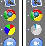
 It is extremely unlikely that you have both Google Chrome and Activity Monitor in Memory Usage mode in your OS X Dock. If you do, though, you’d find the icons hard to distinguish out of the corner of your eye. I moved them to opposite ends of the Dock, but this made it even worse. This is because they clash with the #2 rule of icon usability: keeping icons distinct in shape and colour. ((The #1 rule of icon usability is to make them simple enough to distinguish what the hell they are.)) Activity Monitor made this easy to solve ((My new Activity Monitor colour scheme is much better than the default anyway, since I’m only using it to notice when I run out of free memory and am about to enter Swap Hell.)), but it served as a nice reminder that varying your icons’ shape and colour is worth it, even if your design aesthetic wants them to match.
Rainbow pies
This post is over ten years old. Chances are, I’ve learned enough to have advanced my thinking about some of this stuff.