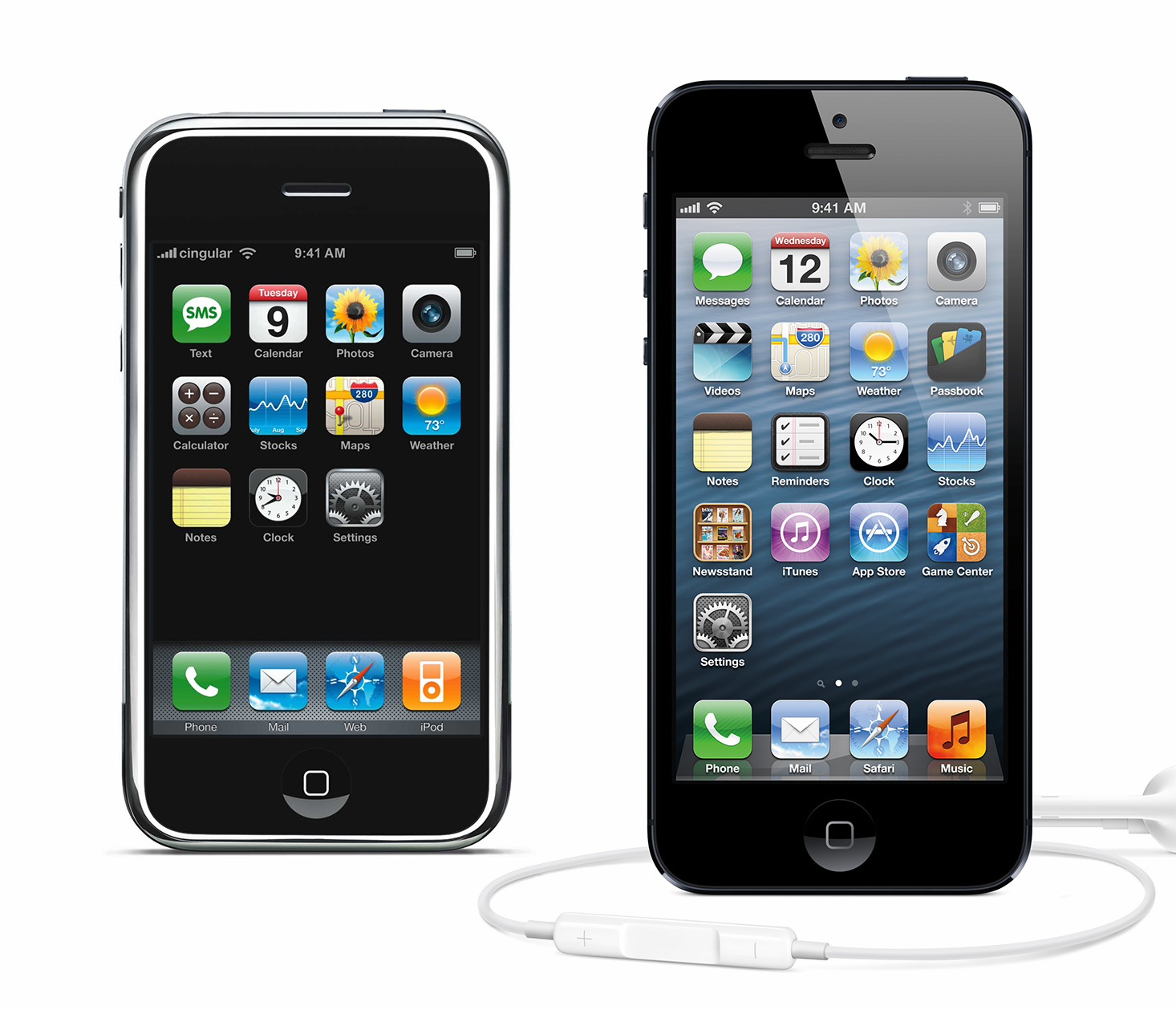
Five years ago, Apple PR released high-quality photos of the newly-announced iPhone. These shots prominently featured the home screen. After five years of subtle improvements, it’s hard to say what’s more striking: the total change, or how much has stayed the same?
The more things change…
The sum of many small changes has a really big impact. The Retina change doesn’t really show in the product shots, but many design changes and post-production decisions do.
-
Naturally, the 16:9 screen is the most dramatic change.
-
Believe it or not, the original iPhone promo shots didn’t have the now-trademark reflective sheen on them.
-
There are seven new icons: Videos, Passbook, Reminders, Newsstand, iTunes, App Store, and Game Center. In retrospect, the empty row for icons on an iPhone with no App Store should have been suspicious.
-
The cellular provider is no longer shown in the promo shots, even though it shows full cellular signal. I’m not sure if this configuration is actually possible.
-
Calculator goes away, although nothing else does.
-
iPod has become Music, Text has become Messages. Next up: Phone becomes Voice?
Boring
Despite these changes, it’s really remarkable how much is the same, five iterations later. How positively boring.
-
Every visible button is still in the same location: home, power, volume, mute.
-
The first and last rows of icons are exactly the same! The same eight apps are in the same eight places in iOS 6 as in iPhone OS 1.
-
The icons have kept their exact shape and spacing. What originally seemed distinctive is now an industry standard.
-
It’s still 9:41, even though the Clock app has changed to a more traditional 10:15.
-
The dock still remains four apps anchored to the bottom of the screen. It’s worth remembering that on the original iPhone the dock wasn’t really even a dock, since you only had one screen and couldn’t rearrange icons.
-
The calendar’s day is the weekday and date of that device’s announcement. Thoughtful consistency though subtle change.
Boring or revolutionary?
Considering how far the functionality has come in these five years, it’s kind of bizarre how little the basic promo shots have changed. The hardware is a little taller, but it’s still fundamentally a refinement. The iPhone team has fed us a steady drip of pleasant refinements that add up to something not revolutionary, but a hell of a lot better than what we had in 2007. Even if it is still 9:41.
