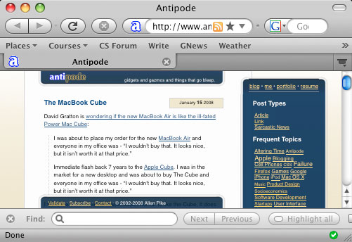
 In the newest nightly build of the upcoming Firefox 3, I received this much improved Mac theme. Instead of looking like a Mac OS X 10.2 era app, it now looks like a 10.4 era one. It has some rough spots, but it’s an improvement none the less. It’s nice to see the browser companies copying each other’s strong points. Safari gets Firefox’s Find As You Type, Firefox gets Safari’s looks.
Firefox’s new Mac theme
This post is over ten years old. Chances are, I’ve learned enough to have advanced my thinking about some of this stuff.