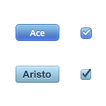
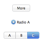
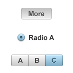
 A recent call for a unified web app UI theme reminded me that there are two awesome web UI themes you can use right now. Both of the leading thick-client web frameworks recently released new themes that:
-
Look great
-
Are licensed as Creative Commons Attribution Share-Alike
-
Come part of a slick framework or as separate assets
-
Start with the letter A
-
Are blue
They’re more similar than they are different, so which do you choose?
 Ace
Ace
Framework: SproutCore
Designer: Cocoia
GitHub: Available as sprited images
New for: SproutCore 1.0
Lickable and saturated, SproutCore’s theme is clearly inspired by OS X’s Aqua. Although their “selected” controls are very bright, their normal look is appropriately plain. You can play with the controls using SproutCore’s sample controls demo.
 Aristo
Framework: Cappuccino
Designer: Sofa
GitHub: Available as PSD or a 3rd party CSS3 implementation
New for: Cappuccino 0.7
Cappuccino’s theme is more focused at looking great on Windows as well as OS X, which is clearly a win for web applications. Its more slate-like look will fit in better with “serious” apps, but doesn’t have the pop that SproutCore’s controls do. They’re available as a PSD file for download. Update: There is indeed an Aristo sample controls page.
What now?
Build a great web app! Consistent UI widgets have been a usability guideline for decades, but limited, ugly, or inconsistent widgets drove web designers to produce a new theme for every app. Next time you start one, whether you’re using the frameworks or stealing their themes, there’s no excuse for having a weak UI theme.