Four months ago, I shared visual mockups of our upcoming app called Party Monster. A few days after that, we had a working prototype. Four months later, we submitted to the App Store. What the heck took so long?
Going universal
Party Monster is the first app Steamclock has built as a Universal app for iPhone and iPad. This seems pretty crazy, considering that we’ve built almost a dozen apps. For some apps there isn’t a lot of extra work to supporting both iPhone and iPad, but most of the apps we do have a thoughtful and polished interfaces. When you have a lot of UI code, getting everything working perfectly with three different screen shapes (iPhone portrait, iPad landscape, and iPad portrait) is a lot more work than just one.
Our philosophy is to do one thing well and then iterate, so we’ve always picked one platform first, and do it right. We have more resources these days, so we went all-in on Party Monster with both iPhone and iPad support. It was a lot of work, but we plan to have all Steamclock apps go universal in the next little while.
Usability iteration
Getting the simple swipe-based UI for playing and pausing songs working was easy, but getting it intuitive was hard. Some users would pick it up and instantly understand, whereas early on some people couldn’t figure out how to play a song. If your users can’t figure out how to play a song in your music app, you’re boned.
Over the last few weeks, we’ve been adding dozens of small affordances to help people through the app. Instead of an annoying tutorial, we’ve been adding little arrows, snips of instructional text, highlighting important buttons, giving better feedback when a user does something weird, and generally tightened up the experience.
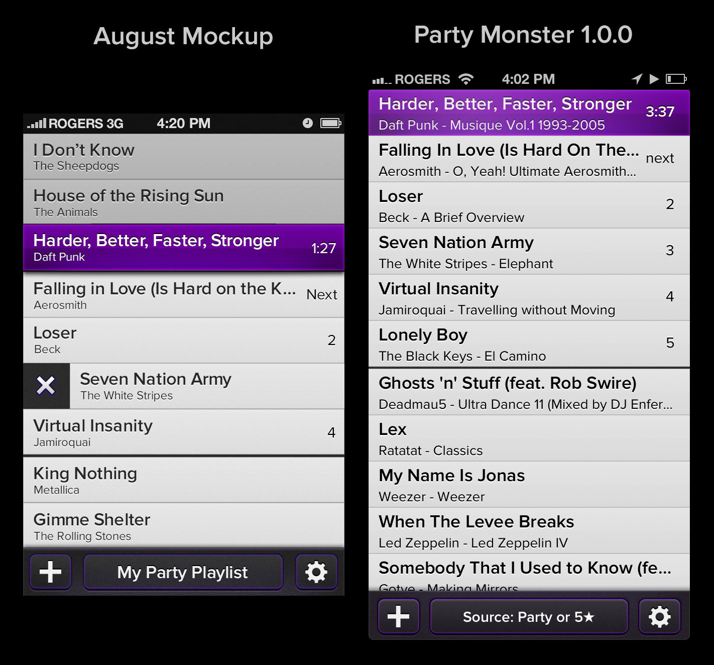
Looking back at the design mockup I posted in August compared to Party Monster 1.0.0, the new version looks… exactly the same. Well, the status bar is blacker, the playing song is flatter, and in the screenshot you can kind of see that the playing song has a glowing animation. For the most part though, all the changes users needed were on the iPad or in the Add Songs interface.
Writing an Add Song dialog
iOS provides its own Add Song dialog, which is serviceable: you can pick some songs, and add them. Unfortunately, it doesn’t support:
- Sizing the dialog to fill only part of the screen on iPad
- Queueing one song at a time without having to dismiss the dialog
- Labeling songs to show that you’ve queued or played them
- Adding extra interactions with the songs like swiping to play immediately
- Labeling songs that won’t play, such as DRM-broken tracks
- Refusing to play Nickelback
So basically a Party Monster that uses the system Add Song dialog is a shadow of its true potential. And so we wrote our own dialog, and with it came an army of little improvements and tweaks.
The tiny little details
Good software is a collection of tiny details. Oh my god so many tiny details.
What happens if you’re dragging a song to reorder it, but it’s currently playing, and it starts to crossfade to the next song while you’re dragging it, but then you drop it below the song that’s fading in? What happens if you’re sliding a song on the iPad, then rotate the device mid-slide? What happens if you have a four second skip crossfade, and then you skip six times in a second? Every edge case is a potential trap for a first-time user to get frustrated or misunderstand how the app works because the first time they did something it went wrong.
Where possible, we added small features and easter eggs that didn’t clutter the UI. The lock screen shows the upcoming songs baked into the album art. If you scroll the playing song off the top of the list, it will stick to the top so you can always see it. If you play a song in the iPad’s Add pane that was already in your queue, it will animate from where it was to where it should be. If a crossfade is in progress, we gracefully handle plays, pauses, skips, and other things that are hard to deal with.
Our most-loved feature, on by default, prevents the playback of Nickelback. This started as a joke, then became a running joke, then became a feature, then became our most popular feature. Believe it or not, there is a fair amount of code involved: we need to pre-scrub any playlists you choose for offending songs, and offer a clear explanation when you try to add Nickelback to your queue. As Canadians, we believe this is the least we can do. We are very sorry for the inconvenience Nickelback has caused to our friends and colleagues around the world.
Launching with feeling
Last but not least, we’re giving Party Monster a proper launch. Yes, all the things you’re supposed to but Steamclock has historically neglected: a scheduled release date (December 6), ads, a professional review, and a promo video. Once the video is done this week, I’ll post it here and give the backstory behind what it takes to build an awesome video for an app. Spoiler: it takes a lot of work!