Yesterday, Steve Troughton-Smith made a fascinating discovery: the long-rumoured iPhone Pro will have a resolution of 1125 x 2436. There have been rumours of an all-screen iPhone for years, but now that we have the resolution, we can finally consider: what does it mean for developers?
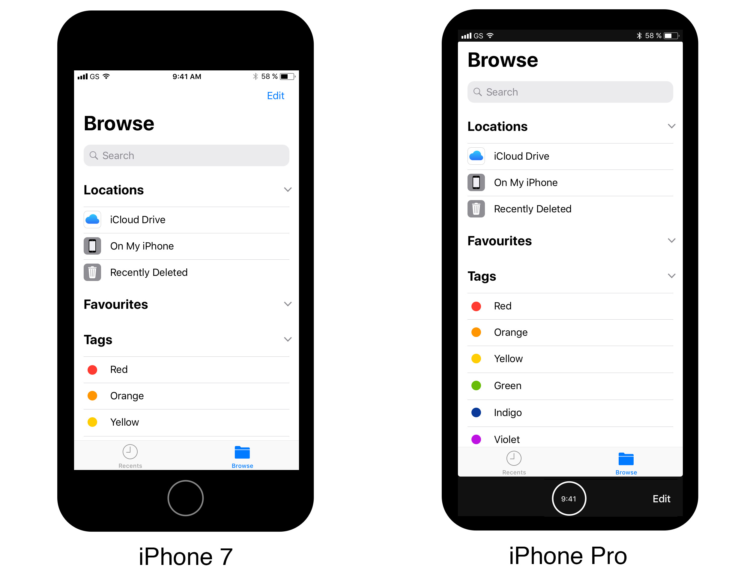
This resolution is 375 x 812 points rendered @3x – exactly the same logical width as the iPhone 7, but 22% taller. Great so far: this width will Just Work™ with any existing app. But are we really going to be displaying apps at 812 points tall?
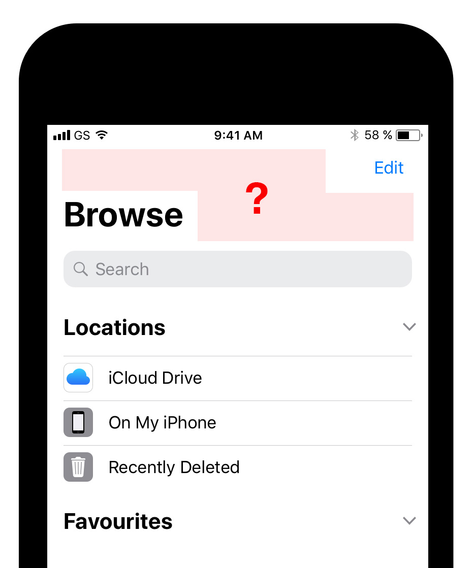
The mockups out there assume yes: the iPhone Pro will be almost entirely screen, apps will fill that screen, and the Home button will be relegated to the back of the phone. Which is possible, I guess, but pretty awful. What could be more important than the Home button? Most people press it dozens of times a day. With no Home button on the front, an iPhone laying on a table would be hobbled. Sad, really.
There’s a reason no phones have their home function on the back. The back of a phone might be tolerable for a fingerprint sensor, but not the Home button.
Home Sweet Home
So, after ten years, the Home button is going virtual. Our beautiful new 812pt OLED display will have a function area carved out of the bottom, with Home in the middle. There are many things Apple could put on either side of the Home button – Android-like multitasking buttons I suppose – but iOS 11 gives us a giant clue.
On either side of the Home button will be your app’s navigation items.
You see, iOS 11 made some visual tweaks. Most were nice refinements, but two system-wide changes seemed arbitrary.
- They shrank the size of the signal strength indicator to make room for the “peninsula” at the top of the iPhone Pro.
- They created the “Large Title” navigation style because… reasons.
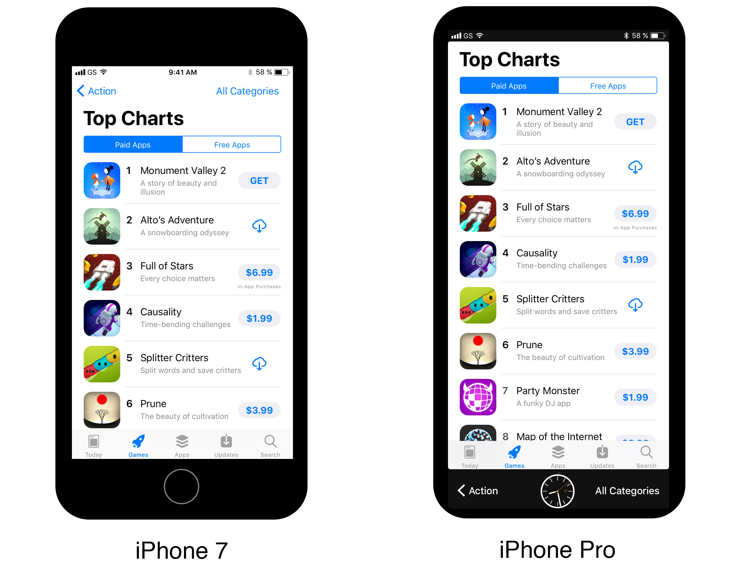
The Large Title in particular looks just plain weird on current hardware. Instead of putting titles in the center of your navigation bar, iOS 11 prefers titles outside of navigation bar, leaving the middle of the screen really empty. Really weirdly empty.
To me, the only way these weird navigation bars make sense is if the iPhone Pro is doing away with navigation bars as we know them. For example:
The mockup above is what happens when you dedicate the bottom 66pt of the iPhone Pro’s resolution to what we currently know as a navigation bar, but replace the title with the home button. Clean, tidy, and surprisingly easy to implement in UIKit: apps’ default interface to navigation bars just specifies left and right items, rather than explicitly laying things out at the top of the screen. A lot of apps could work this way with just a recompile.
Of course, tidiness isn’t enough. Getting 44pt of additional space for content is nice too, but to change navigation this dramatically, it has to also be better to use. Considering how much easier it is to reach the bottom of the screen than the top of the screen, you better believe it’d be better. In May, crackerjack designer Brad Ellis wrote:
Expect to see more apps move functionality to the bottom on the most reachable part of the screen.
I think he was right, but not in the way I expected. Rather than thoughtfully evaluating how we can shift navigation to the bottom of the screen app by app, we’re going to be pulled into the future all at once on Jony’s Fun Train.
Isn’t it beautiful? Instead of the Back button being located in literally the least convenient place on the screen, imagine it right under your thumb, nestled right beside our old friend the Home button. Maybe they’ll even let Jony put a little clock face in there. It’s going to be wild, people.
Hold on to your butts.