The iPhone X is packed with new and novel technology. Face ID. OLED. Dual cameras in a compact package. As fascinating as that all is though, it has an unusual property that been little discussed: this phone is really, really tall.
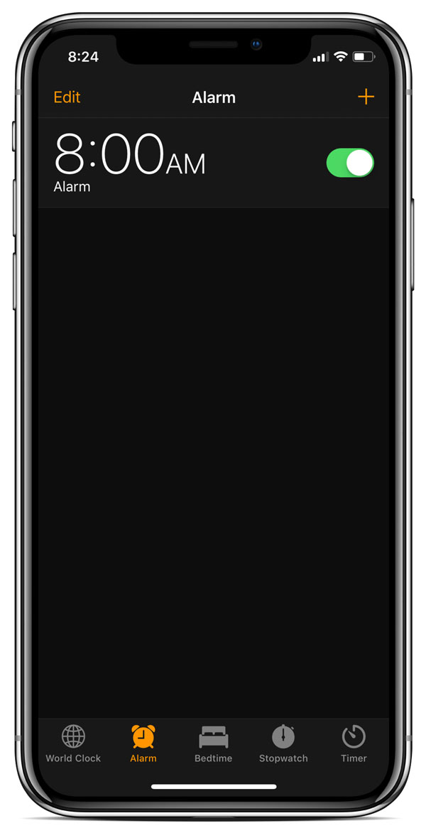
iPhone X’s screen is the tallest ever in an iPhone. It’s 30% taller than the comparably-sized iPhones 6 through 8, and even 11% taller than the enormous iPhones Plus. Meanwhile, it is only slightly wider than an iPhone 6. As a result, the X’s display has a downright Chockian aspect ratio of 2.17 to 1.
That is to say, it is tall.

Unfortunately, this has fuelled the Apple-hater meme that the iPhone X isn’t usable one handed. According to these pundits, reaching Control Center is “damn near painful”, “you need to shimmy it every time”, and “it feels like I’m going to drop my phone, Jesus this thing is as slippery as a wet bar of Pears.”
While it may be true that this ultra-tall screen makes Control Center and other top-oriented UI frustrating to use, it’s worth remembering that iPhones are designed by some of the most talented and creative people in the world. Apple’s industrial designers must have prototyped shorter phones with the same edge-to-edge design. They also surely evaluated making it slightly wider to make it better for reading on. But after all their testing, they decided that the “phone of the future” should have a tall and narrow screen. So let’s ask: why?
Room for activities
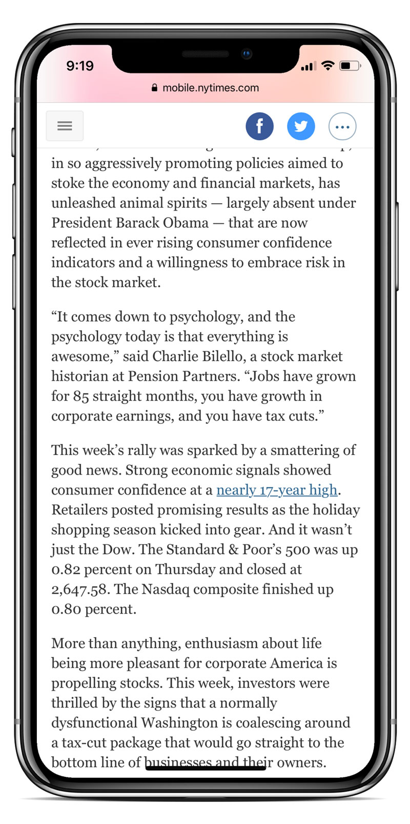
 Anybody who has used an iMac or iPad Pro knows that a larger screen can make you more productive. Big screens allow you to keep multiple apps on screen at once, and they can acommodate wider, more readable line lengths. The iPhone X’s tall screen does neither of these things – but what it does do is show more lines of text at once.
Now, you may ask: “Doesn’t increasing the aspect ratio beyond the 1.8:1 ratio of human vision provide little value, especially considering the narrow height of the retina’s focal area?” And I would respond by saying: why are you asking me this? I’m not a doctor. Do I look like a doctor?
Okay whatever, maybe a narrow aspect ratio isn’t ideal for text, but let’s be honest: kids these days don’t read anymore. It’s all about photos and videos, and that’s what the new iPhone’s Super Retina display all about.
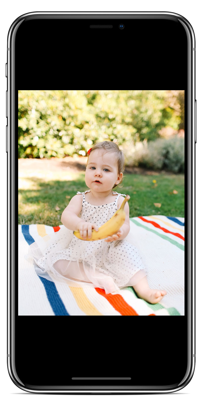
If you’re a photographer, you may know that really wide screens are great for viewing images,  if those images happen to be panoramas. If you’re a fan of panoramas, the iPhone X’s aspect ratio is perfect for you. Even if you’re not, you’ll find that displaying normal photos on iPhone X is also possible.
Another place the iPhone X’s aspect ratio shines is movies. While it has been observed that the screen is effectively no larger than an iPhone 6 for watching TV or YouTube videos, iPhone X’s 2.17:1 format is nearly the same ratio that Lawrence of Arabia was filmed in. Lawrence of Arabia! In fact, most theatrical releases are filmed in an even wider ratio, 2.39:1. This makes this otherwise strange aspect ratio great for watching feature films, which is excellent if you’re the kind of person who likes to kick back for three hours and watch The English Patient on your phone.
Lay of the land
Although text, photos, and videos are the primary content people care about, it’s also worth considering what benefits an exaggerated aspect ratio has for app UI.
While landscape apps on iPhone X are as cramped vertically as they are on an iPhone 6, iPhone X gives app developers a lot more space available beside their content. As a result, you get to enjoy much more of your favourite apps’ background colours.
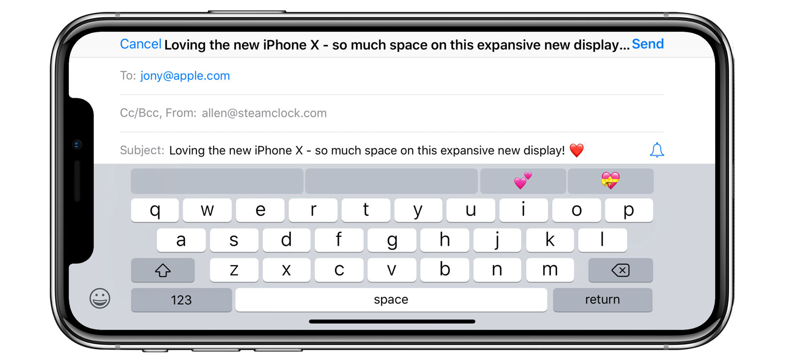
Typing in landscape on the iPhone X is especially distinctive. The keyboard appears front and center, while still giving you enough space to see not only the line of text you’re typing, but often the line before and after it.

A tall order
In summary, the surprisingly tall aspect ratio of the iPhone X has a non-zero number of advantages over a more ergonomic screen height. While a somewhat shorter display would be easier to hold, use, and develop for, it would be substantially worse for watching Peter O’Toole tromp around the desert.
Now that we’ve entered the iPhone’s “Generation X”, there is speculation abound about what other screen sizes may be available in upcoming designs from Apple. Will 2018 see an iPhone SE-X that offers most of the iPhone X’s screen width but with a more thumb- and pocket-friendly height?
No.
Will we ever understand exactly why the iPhone X’s display is so curiously proportioned? Also no.
No, our job is not to understand. It is to stretch our thumbs, put cases on these beautiful glass slabs, and appreciate that despite its flaws, the iPhone X is a truly remarkable device.
Even if it is a little bananas.