When launching a product, especially a consumer-oriented one, you want it to be interesting. A novel, bold, or distinctive UI can make an app stand out from the crowd, be memorable, and inspire curiosity. Plus, it’s cool.
Luckily, there are a lot of ways you can make an interface interesting. You can use striking colours, intriguing illustrations, or thoughtful copywriting. You can add whimsical touches of animation or sound. You can make the feature set brilliantly simple, or awesomely powerful. Almost any part of an app can be a good place to add novelty, except for one: navigation. Navigation is different.
Navigation should be boring.
With a delightfully boring navigation scheme, users don’t need to learn how to explore your app. Their “attention span budget” can thus be spent considering how your new thing can fit into their lives, rather than trying to recall how many fingers they’re supposed to drag from the left side of the screen in order to pull out the Alternate Quick Access Wheel.
While experienced design and development teams will usually tamp down on the worst navigation fever dreams in short order, there is often still an allure, or even explicit pressure, to build out novel navigation patterns. It’s just so damn satisfying to transcend the standard fare. “Would it be so bad if we just tried just a little horizontal scroll here, and just one two-finger gesture there…?” One thing leads to another, and your app’s first-run experience is a screen filled with goofy arrows and hand-written tips like “insert tab A into slot B to view next photo”.
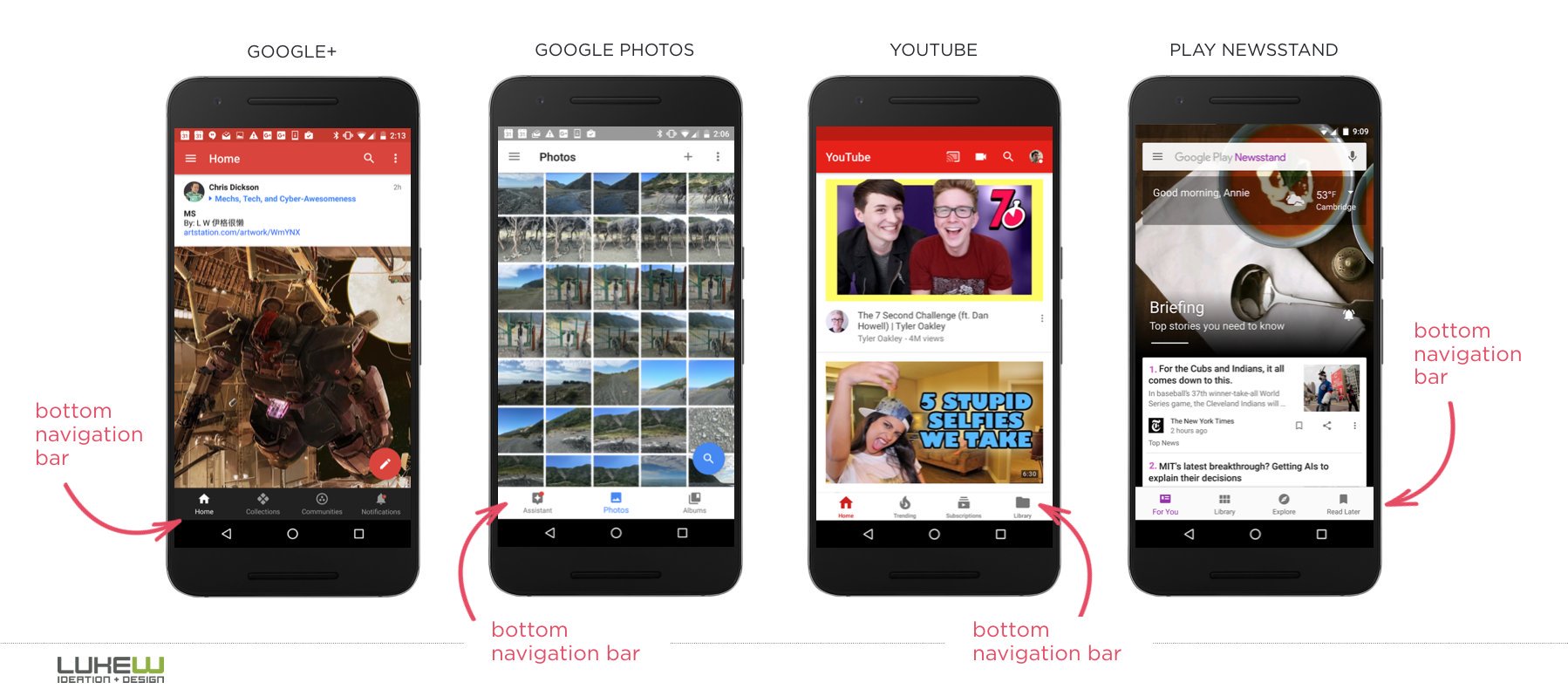
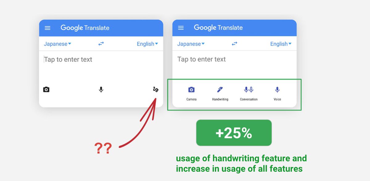
If you’re weird-navigation skeptic, then take heart: the data is on your side. The A/B tests and other success metrics I’ve seen almost always support clear, familiar navigation approaches. Tab bars get better engagement than hamburger menus, many users don’t even find gestures, and simple menus work better than whiz-bang feature dashboards. Boring navigation affordances lead to more navigation, and faster navigation, than clever ones do. As the nobly helmeted interaction designer Luke Wroblewski likes to say, “Obvious always wins.”
Of course, metrics aren’t everything, and there are examples of products that have implemented novel navigation schemes that were very well received. Even ignoring the obvious exception of games, a lot of the most interesting apps released over the years – from Jared Sinclair’s Unread and Q Branch’s Vesper on the indie side, to Snapchat and Facebook’s Paper at other end of the spectrum – invested in novel navigation patterns and styles that made them truly distinctive.
Which is super cool. But also kind of sad, since this type of investment doesn’t typically pay off.
The high price of failure
Notwithstanding the usability pitfalls, there is a bigger reason why a new app shouldn’t have an experimental navigation scheme: the cost is too damn high.
We know that building good products is all about iteration. And typically, the parts of your product that need the most iteration are the novel ones. The neat stuff, the distinctive bits. That’s no problem if you’re iterating a sound effect, a button asset, or even better a core user-facing feature. It gets expensive and wasteful fast though if you’re thrashing around how your screens are organized, divided, and connected. God help you if you’re halfway through a wild navigation experiment and an iOS update breaks your custom UINavigationController wallhacks before you’ve even been able to market-test them. It’s no fun.
Once you ship, things go from bad to worse. Overhauling the navigation of a living app is even more time-consuming, and is also usually poorly received by existing users – even if the new scheme is objectively better. Just ask Snapchat: after they concluded their wacky navigation scheme was inhibiting long-term growth, they launched a reworked UI that was easier to use – and monetize – but suffered a huge backlash from users who were used to the old UI. Perhaps if they’d tracked towards clear navigation a little earlier, Instagram wouldn’t be eating their lunch as badly today.
Of course, it doesn’t matter what’s good for Snapchat or anybody else. What matters is what’s good for your product and its customers. The app you’re building today. And if your goal is to make a distinctive app, then dollar for dollar, sprint for sprint, novel navigation schemes are one of the worst ways to achieve that.
So do your app a favour: keep the navigation boring. At least at first. Use colour, typography, and the many other tools in your tickle trunk to make your product interesting and appealing while you prove out your business model. Invest in navigation, sure – but invest in making it clear, fast, and good.
That is to say: make it boring.

