At Steamclock, we like to share docs. Guides, notes, plans – writing helps get think and working more asynchronously.
Google Docs is okay for this purpose, but by early 2021, we knew we’d outgrown it. We’d seen glimpses of what more modern knowledge base and note-taking apps could do, and we wanted a piece of that. Something that would make our shared knowledge easier to find, navigate, and collaborate on. And ideally, something that was, I don’t know, a bit nicer?
We could have just gone straight to Notion. We’d seen people getting good mileage out of Notion, and the way its hierarchical structure makes related docs easily findable. And, critically, Notion lets you label each page with an emoji. Very critical.
Still, we didn’t want to just bandwagon the default thing everybody else was using, especially given Notion’s oddly unintuitive text editing and selection behaviour. We wanted to put in a bit of research. A bake-off, of sorts. So we surveyed the field.
Any Challengers?
- Confluence: All function, no form. Nope.
- OneNote: Not really intended for building a company knowledge base. Nope.
- ClickUp: “One app to replace them all” – sounds a bit ominous. We already have project management software, we’re just looking for a place to keep and share notes and docs. So, nope.
- Coda: Not the code editor that became Nova – the all-in-one doc editor. This one was interesting.
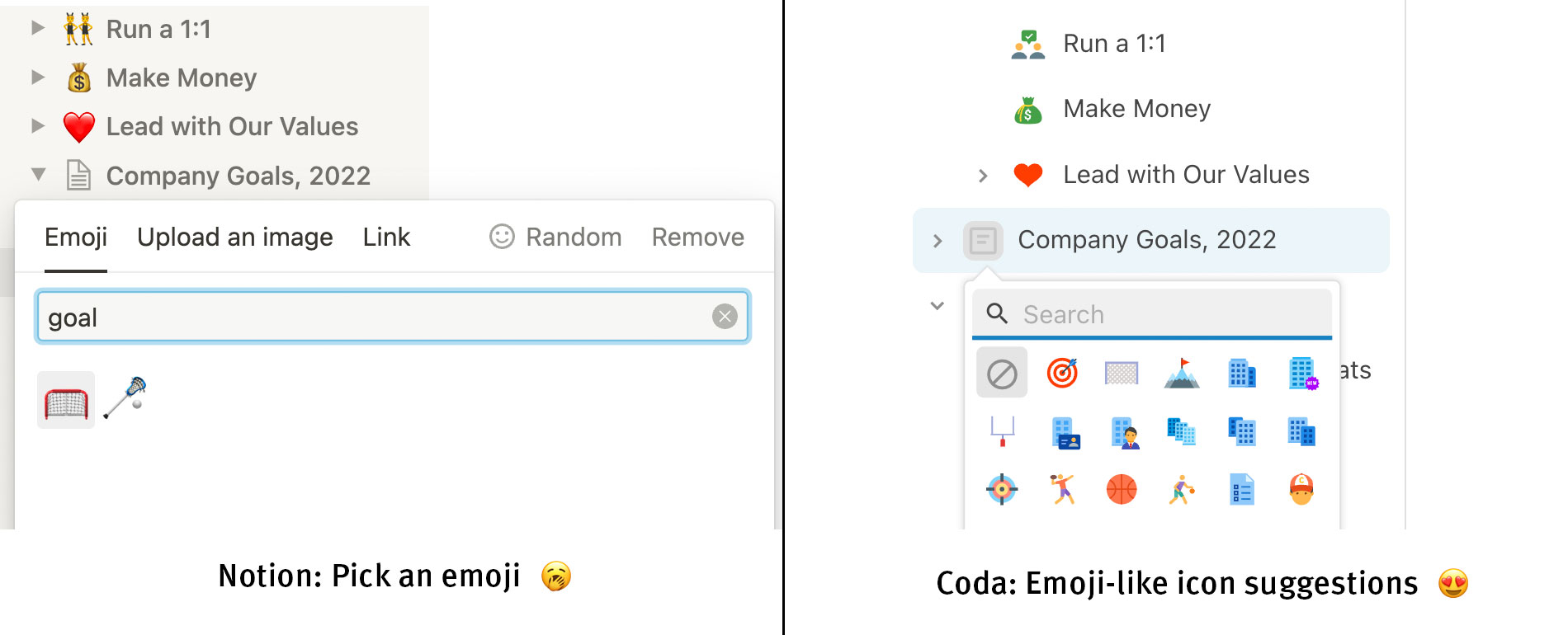
You see, Coda had the structure we liked in Notion, where docs are organized into hierarchical sub-pages, labelled with the all-important emoji. But in Coda, there were more emoji to pick from! So that settled it.
Okay, there were also a couple things beyond the emoji that we liked about Coda, for example:
- Coda had more robust support for tables than Notion in our testing, and the Coda team was specifically focused on developing dynamic and scriptable functionality around tables and data. Maybe it could replace Google Sheets for us too?
- The way editing simple lists works in Coda was more natural, as opposed to Notion which had some really weird editor behaviours. Perhaps the worst of these was that selecting text across bullet points would cause the selection in Notion to “blow up” and start covering entire blocks of content that you didn’t want to select.
- You need to believe me how much nicer the page-icon emoji thing is in Coda. Not only do they have way more icons than just the standard emoji set, but they also do a good job of letting you type e.g. “research” and it shows research-related icons. If you type “research” into Notion’s page-icon picker, you get no results. Coda even auto-suggests icons based on the page title! 😍

In Coda, a reasonable and nice page icon is a single click away – no emoji-hunting required.
So after building out a demo-scale version of our docs in both Coda and Notion – a dozen or so docs in each – we decided that Coda was just a bit more compelling for our needs. We made the switch, worked through porting our various docs, guides, and notes, and it was so much better than Google Docs! We immediately tore into expanding and refining our guides on various things, ranging from onboarding to project management to development process and more. We started moving more of our decision-making processes to be asynchronous and doc-oriented. We started running more of our company with docs.
It was great!
But – of course, obviously – we started to hit issues with Coda. Things that weren’t so obvious at demo-scale, that give me the sense that creating a knowledge repository isn’t the use case Coda is really focused on.
Take a look, I made some changes
Here’s an example. A common thing you might want to do when collaborating on a doc – a proposed policy, a brief, a guide, whatever – is have one or more team members make some changes, then have another team member to review those changes.
The old-school way to review changes would be to use a word processor’s Track Changes feature, scrubbing through diffs of the document, and dealing with any merge conflicts or emailing documents around – blech. Nowadays teams use a feature like Notion’s “Updates” pane to see what’s changed on a given page and iterate from there or provide feedback. You would do the same thing in Coda, but we somehow missed that it just… doesn’t have this feature.
Update, Dec 2022: The folks at Coda have now launched a Track Changes feature, which is great. They invited me to the beta test, referencing this article – so they are indeed listening! 🎉
Coda nominally offers a version history, but it’s more of a proof of concept than a thing for people to use. It offers you a list of all previous versions for the entire doc hierarchy. You can scroll through those versions – some mere seconds apart from one another – but there’s no indication which of them actually affected the page you’re looking at, so you can’t actually use it to answer questions like “when did this content change last” or “what new sections did Maria add to this guide?” or any other meaningful question relating to what’s new.
This seems like kind of an odd deficiency for a featureful product geared towards writing and sharing docs. Wouldn’t any team that is collaborating on a guide, policy, proposal, or other written doc want this feature? 🤔
Coda’s product team is pretty active and engaged, frequently shipping new features large and small, so I went to their forums to see if this was on its way, and leave my two cents. The thread for this issue has been pretty active, so they’re certainly aware of the need. In September ’21 the Coda team shared an update:
We don’t have plans to launch this near term, but the Coda’s new editor would make this feature more feasible.
Well, that’s good to know at least. Their new editor, with better table support, did launch in February. Maybe this is now on their nearer term roadmap?
Update, Dec 2022: Coda recently made some improvements to their version history UI, but it still doesn’t let you view history for a page. I was recently talking to a Coda user from a Fortune 50 who also finds this frustrating, so hopefully this does get resolved at some point.
I would be more hopeful if this was the only mysteriously missing feature when it comes to written docs. There are others, but to me the most worrying canary is Coda’s search.
Find! That! Page!
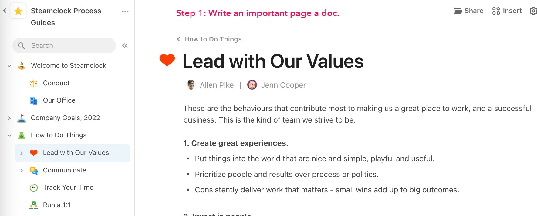
A huge selling point of Coda or Notion over Google Docs is the ability to organize long docs or related docs into easily navigable and linkable titled pages with memorable little emoji, arranged in a hierarchy. It’s a key part of the whole thing.
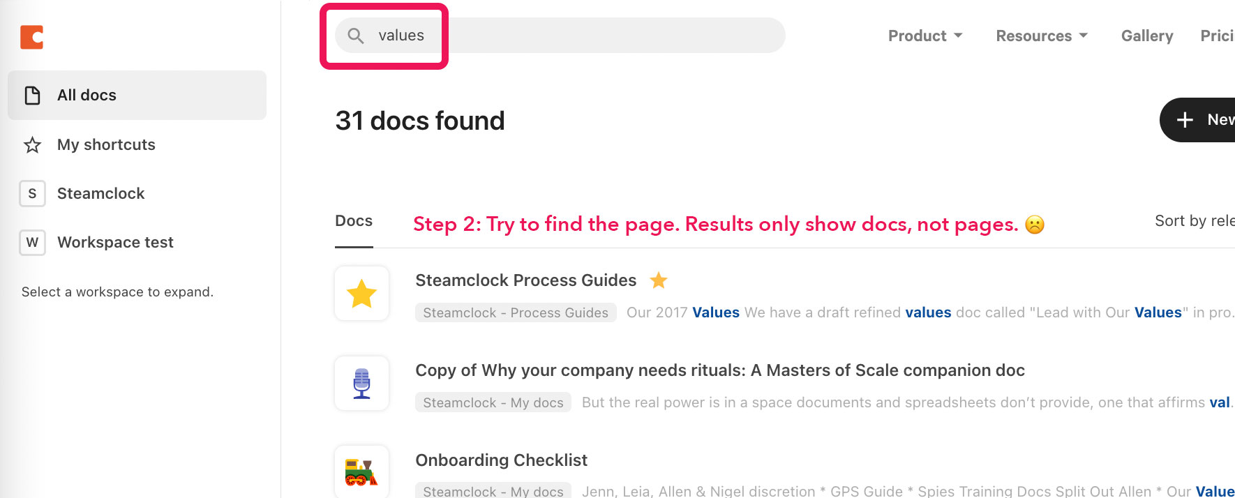
However, Coda’s search function doesn’t actually surface these pages in their results. Coda searches for docs, which are the root-level containers like “Project Flamingo” or “iOS Development Guides” – that can have dozens of short mini-docs within them, which Coda calls Pages. Each page will have its own title, topic, and – yes – emoji.
So, pretty quickly – but not quickly enough that we noticed during evaluation – you end up in a circumstance where you have a doc like “Employee Handbook” with a short but important page titled ″Reimbursements”. But if you type reimbursements into search, Coda only returns the top-level handbook that has, since our team is so darn good at documenting things, a lot of other topics in it.
The difficulty of searching for pages has led to a sense on our team that they can’t find things in Coda. It increases the friction around referencing or maintaining pages, and reduces the overall participation of our team in our docs and guides.
This is bad.


Unlike the issue with version history, it seems like we are the only Coda users who care about this? Or at least, I’m the only one complaining about it. This issue has been such a drag for our team that I’m legitimately curious how this isn’t something Coda is getting a lot of complaints about. It raises so many questions in my mind:
- What’s the point of writing a page if nobody can find it?
- Am I just an extreme stickler for my team being able to effectively find docs?
- Are Coda users using some kind of weird workaround for this?
- Or, and this seems maybe most likely, are teams that want to build guides and handbooks like ours just choosing Notion instead of Coda? Has the population of Coda users self-selected itself to to mostly care about tables rather than team-facing written docs like these?
It seems to me, from reading the tea leaves, like Coda’s development team is moving pretty rapidly, but they’re moving rapidly in the direction of providing more tools around tables and data-driven workflows. They don’t seem particularly focused on making Coda a really great place to write, collaborate on, and share written documentation for your team.
And don’t get me wrong – Coda’s functionality around tables is cool. They have a model where tables are actually kind of more like mini databases. It adds a learning curve since they do not really behave like spreadsheets, but it seems like a potentially fruitful path towards letting people build smart docs that help with the kind of project and process “glue” that people used FileMaker for back in the day.
But for teams that are focused on written docs, that’s just a bonus. Extra credit.
We need a great tool for sharing and maintaining written documentation. Things like guides, policies, and other prose-centric docs certainly can be maintained in Coda, and it’s better than Google Docs for sure, but we’ve found that as we built out these kinds of docs, there were missing features that made finding, using, and maintaining written docs kind of frustrating.
So a year in to using Coda, I’m increasingly confident that for our writing-centric needs, Notion would have been a bit of a better fit. Not that much better, mind you. But enough better that it kind of annoys me.
Meanwhile, while Coda was rebuilding their editor to better support tables and be more scriptable, Notion was rebuilding their editor to better support text. In January, Notion shared a video demoing their fix for the very same text selection behaviour that initially sparked my “there must be something better than Notion” quest last year.
We finally did it 😤 Notion’s text editor has been completely rebuilt to combine:
— Notion (@NotionHQ) January 19, 2022
- the flexibility of “blocks”
- the ease of a traditional word processor
Rolling out this month on desktop & mobile: SELECT TEXT ACROSS MULTIPLE BLOCKS! pic.twitter.com/9quc4GxtTJ
I doubt the Notion team fixed this just to aggravate me, an internet rando who’d recently pitched bringing their team over to a competing product in part because of this minor but infuriating UX quirk. But maybe, I don’t know.
I’ll be keeping an eye out on Notion’s emoji picker. As of April 2022, it’s still woefully simplistic compared to Coda’s. With luck it will stay so, staving off unwanted thoughts of migrating our carefully curated – but somewhat hard to search – repository of docs to yet another system.